Understanding popular technical analysis studies
E*TRADE from Morgan Stanley
10/25/24As you probably know, technical analysis is the technique of evaluating securities by using price charts to analyze trends in the security’s historical pricing and volume data. The advanced charting capabilities in Power E*TRADE provide more than 120 studies and over 30 drawing tools designed to help you identify these trends and patterns. Let’s look at three particular studies that are available in Power E*TRADE and often used by traders.
Simple Moving Average
One of the most popular indicators in technical analysis, the Simple Moving Average (SMA), is a lagging indicator which calculates the average closing price of a stock over a given number of days. Like other moving average indicators, its aim is to determine the direction in which the price of the stock is moving and estimate its future direction, based on previous prices.
- The SMA is calculated by adding previous closing prices and dividing the result by the number of time periods under consideration.
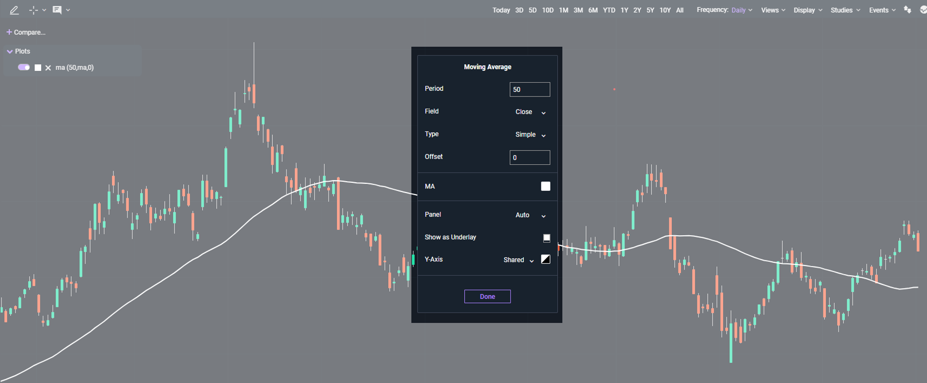
- Power E*TRADE will use 50 days as the standard period. So, the SMA at any given time is the average of closing prices for the previous 50 days.
- The 50-day period moves forward one day each day (hence the term “moving”) and the SMA is plotted as a continuous line on the underlying security’s price chart.
A trader may choose to use the SMA as an indicator of whether a security’s price will rise, or if it will reverse. A common interpretation of the SMA is that a price trading above the SMA is in an uptrend, and a price trading below it is in a downtrend—with those indications then being used to inform trading strategies.
It’s important to note that because the SMA is based on the average of past prices, it may be of more limited use during fast-changing or sideways markets.

Fig 1. A standard 50-day SMA indicator, constructed by selecting Moving Average from the Studies menu, then customizing the type as Simple.
Relative Strength Index
The Relative Strength Index (RSI) is a widely-used technical indicator which measures the speed and magnitude of the changes in a stock’s price by comparing recent gains to recent losses. A lagging momentum oscillator, the RSI may help traders and investors spot potential trend reversal signals and strategize on entry and exit points.
- To calculate this indicator, the average gains from a desired period are added, then divided by the average quantity. The resulting value is referred to as relative strength.
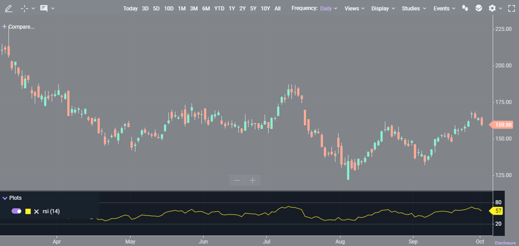
- Power E*TRADE will default to a period of 14 days, though short-term traders may prefer a shorter period and long-term traders might prefer a longer one.
The relative strength value is shown on a range from zero to 100, where a value above 70 indicates that the stock may be overbought (suggesting the potential for a price decline) and a value lower than 30 indicates a possible oversold condition (suggesting the potential for a price increase). Given that the RSI is gauging the strength of price movements, traders frequently use it concurrently with other types of indicators such as moving averages or the MACD.

Fig 2. The RSI indicator displayed as a sub-chart with a period of 14 days and RSI value of 57.
Moving Average Convergence Divergence
The Moving Average Convergence Divergence (MACD) is a momentum indicator that may help spot significant changes in price movement influenced by market sentiment and volatility. It’s derived by calculating the difference between two exponential moving averages.
This technical indicator—consisting of an MACD line, signal line, and a bar graph referred to as a histogram—is often used to identify divergence between price and momentum in the market, which some traders may interpret as a signal of a possible reversal.
- The standard method Power E*TRADE uses to calculate the MACD line is to subtract the 26-period Exponential Moving Average (EMA) from the 12-period EMA.
- The signal line is established by calculating a 9-day EMA of the MACD line.
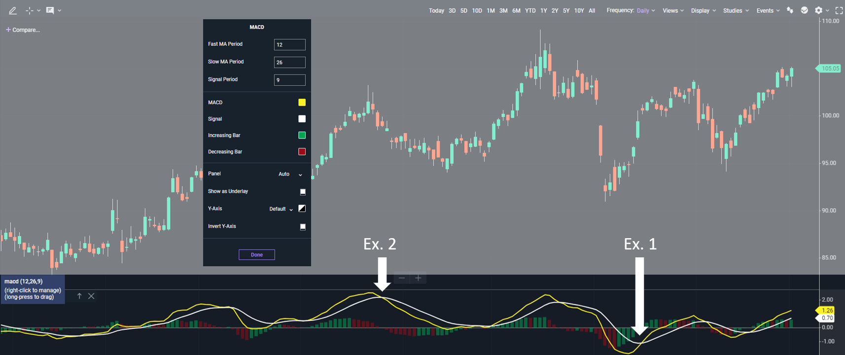
- When the MACD line crosses above the signal line it is considered upward, bullish movement and a buy signal (See Ex. 1 in the chart illustration below).
- The MACD line crossing below the signal line may indicate downward price movement and might be considered a sell signal (Ex. 2).
- The histogram is represented in the MACD indicator as a bar graph and shows the difference between the MACD line and the signal line. This reflects the strength of the price signals.
Traders may use the MACD indicator for a variety of purposes, including to spot bullish and bearish trends and momentum, to discover opportunities to open a position, or to consider establishing an exit plan for an existing position.

Please remember that while technical analysis indicators may be suggestive of bullish and bearish momentum, and may help with anticipation of a stock’s future movement, they should not be taken as definitive signals of upcoming price moves nor recommendations on whether a trader should buy or sell. These technical analysis tools are valuable to help traders make more informed, data-driven trading strategy decisions and are often used in conjunction with fundamental analysis.
Ready to see these tools in action? Watch our on-demand webinar featuring ways to use Power E*TRADE for technical analysis, hosted by E*TRADE Education.